What’s CSS
To make Web pages stand out, we must use CSS (Cascading Style Sheets). CSS is a computer language that can describe the appearance of an existing HTML document. CSS can refer to different parts of a document and configure various appearance attributes such as foreground and background color, font, alignment, spacing, borders, paddings, etc. This assignment will give us a chance to learn about how to use CSS to style Web pages.
Grammar
Styling a document’s look and feel
Styling elements with the style attribute
An HTML element’s style attribute can configure the look and feel of the element by changing the values of its style properties as shown below
<element style="property1: value1; property2: value2">
  element body
</element>
The value of the style attribute is a string formatted with a language called CSS or Cascading Style Sheets and is the focus of this assignment. For example, the code
<p style="background-color: blue; color: white">
  Style attribute allows configuring look
  and feel right on the element. Although it's
  very convenient it is considered bad practice
  and you should avoid using the style attribute
</p>
will be rendered as
Style attribute allows configuring look and feel right on the element. Although it's very convenient it is considered bad practice and you should avoid using the style attribute
Style documents with style tag
A slightly better way to configure the look and feel of a Web page is to declare CSS rules in the <style> tag in the <header> and then refer to the tag by their selector, e.g., name, ID, or class. It’s better because you can control the style of a whole page from a central place instead of dealing with individual elements.
<head>
   <style>
       p {
           background-color: blue;
           color: white;
       }
   </style>
</head>

<!-- new style tag
     selector "p" refers to all paragraphs
     sets all paragraph background color to blue
     sets all paragraph foreground color to white
-->
Linking CSS styling documents with the link tag
Although the style tag is slightly better than the style attributes, styling an entire website will entail editing many style tags in their HTML documents. Instead of changing styles inside many HTML documents, it is a best practice to do all styling configuration in separate CSS files and then link the files from the HTML document with the link tag.
   <link href="index.css"
         rel="stylesheet"/>
Selecting content to style with selectors
Selecting content with ID selectors
The CSS rules in previous exercises styled all paragraphs at once by using the name of the tag p and then specifying the style property values. Instead of changing the look and feel of all the elements of the same name, e.g., p, we can refer to a specific element by their ID, an attribute specifying a unique identifier.
/*p {
 background-color: blue;
 color: white;}*/
p#id-selector-1 {
 background-color: red;
 color: white;
}
p#id-selector-2 {
 background-color: yellow;
 color: black;
}<h3>ID selectors</h3>
<p id="id-selector-1">
Instead of changing the look and
feel of all the elements of the
same name, e.g., P, we can refer
to a specific element by its ID
</p>
<p id="id-selector-2">
Here's another paragraph using a
different ID and a different look
and feel
</p>Selecting content with class selectors
Instead of using IDs to refer to specific elements, you can use an element’s class attribute instead, or a combination of both. Class selectors can be used just like ID selectors if you keep them unique, but can also be used to apply the same style to several elements, even if they are different types of elements. We will be using class selectors exclusively from now on.
.class-selector {
 background-color: yellow;
 color: blue;
}<h3>Class selectors</h3>
<p class="class-selector">
Instead of using IDs to refer
to elements, you can use an
element's CLASS attribute</p>
<h4 class="class-selector">
This heading has same style as
paragraph above</h4>The example above declares a selector that declares a style that transforms the background and foreground color. We can then use the selector to apply the transformation to several elements. The above example applies the style to two elements, the paragraph and the heading.
Selecting content based on the document structure
Selectors can be combined to refer to elements in particular places in the document. A set of selectors separated by a space can refer to elements in a hierarchy. For instance: .selector1 .selector2 { … } refers to an element whose class is .selector2 and is inside some descendant of another element whose class is .selector1. If we use ”>” instead to separate the classes, then we can establish a direct parent/child relationship.
<div class="selector-1">
 <h3>Document structure selectors</h3>
 <div class="selector-2">
  Selectors can be combined to refer elements in
  particular places in the document
  <p class="selector-3">
   This paragraph's red background is referenced as
   <br/>.selector-2 .selector3<br/>
   meaning the descendant of some ancestor.
   <br/>
   <span class="selector-4">Whereas this span is a
     direct child of its parent</span>
   <br/>
   You can combine these relationships to create
   specific styles depending on the document
   structure
  </p>
 </div>
</div>
.selector-1 .selector-3 {
background-color: red;
color: white;
}
.selector-2 > .selector-3 > .selector-4 {
background-color: yellow;
color: blue;
}Styling Color
Styling the foreground color
Foreground colors can be configured using the CSS color property as follows
.some-css-selector {
   color: blue;
}
Colors can be defined as follows
- As strings, e.g., white, red, blue, etc
- As hexadecimals, e.g., ABCDEF
- As RGB, e.g., rgb(12, 34, 56) Example:
.fg-color-black { color: black; }
.fg-color-white { color: white; }
.fg-color-blue { color: #7070ff; }
.fg-color-red { color: #ff7070; }
.fg-color-green { color: green; }<h2>Colors</h2>
<h3 class="fg-color-blue">Foreground color</h3>
<p class="fg-color-red">
The text in this paragraph is red but
<span class="fg-color-green">this text is green</span>
</p>The example above will be rendered as:
Foreground color
The text in this paragraph is red but this text is green
Styling the background color
.bg-color-yellow {
   background-color: #ffff07;
}
.bg-color-blue {
   background-color: #7070ff;
}
.bg-color-red {
   background-color: #ff7070;
}
.bg-color-green {
   background-color: green;
}<h3 class="bg-color-blue fg-color-white">Background color</h3>
<p class="bg-color-red fg-color-black">
This background of this paragraph is red but
<span class="bg-color-green fg-color-white"> the background
of this text is green and the foreground white</span>
</p>The code above will be rendered as:
Background color
This background of this paragraph is red but the background of this text is green and the foreground white
Styling the box model
Styling borders
Use CSS border properties to configure the look and feel of the border around content. Here’s a sample of the properties that can be configured.
.some-selector {
  border-width: 10px;
  border-style: solid|dotted|dashed|double;
  border-color: red | blue ...;
}
/* configure border with several properties*/
/* border's width. Can also provide per border*/
/* the style of the border*/
/* the color of the border     */
.border-fat {
border-width: 20px 30px 20px 30px; }
.border-thin {
border-width: 4px; }
.border-solid {
border-style: solid; }
.border-dashed {
border-style: dashed; }
.border-yellow {
border-color: #ffff07; }
.border-red {
border-color: #ff7070; }
.border-blue {
border-color: #7070ff; }<p class="border-fat border-red border-solid">
Solid fat red border</p>
<p class="border-thin border-blue border-dashed">
Dashed thin blue border</p>The code above will be rendered as:
Solid fat red border
Dashed thin blue border
Stying margins and paddings
.margin-bottom {
  margin-bottom: 50px;
}

.margin-right-left {
  margin-left: 50px;
  margin-right: 50px;
}

.margin-all-around {
  margin: 30px;
}<div class="margin-bottom
padded-top-left
border-fat border-red
border-solid
bg-color-yellow">
Margin bottom</div>
<div class="margin-right-left
padded-bottom-right
border-fat border-blue
border-solid
bg-color-yellow">
Margin left right
</div>
<div class="margin-all-around
padding-fat border-fat
border-yellow
border-solid
bg-color-blue
fg-color-white">
Margin all around
</div>The code above will be rendered as:
Stying corners
You can configure the corners of element borders to be rounded. Either all of them at once or specific corners. You can do this by configuring a border’s radius.
.rounded-corners-top {
 border-top-left-radius: 40px;
 border-top-right-radius: 40px;
}

.rounded-corners-bottom {
 border-bottom-left-radius: 40px;
 border-bottom-right-radius: 40px;
}

.rounded-corners-all-around {
 border-radius: 50px;
}

.rounded-corners-inline {
 border-radius: 30px 0px 20px 50px;
}<p class="rounded-corners-top border-thin border-blue border-solid padding-fat">
Rounded corners on the top
</p>
<p class="rounded-corners-bottom border-thin border-blue border-solid padding-fat">
Rounded corners at the bottom
</p>
<p class="rounded-corners-all-around border-thin border-blue border-solid padding-fat">
Rounded corners all around
</p>
<p class="rounded-corners-inline border-thin border-blue border-solid padding-fat">
Different rounded corners
</p>The code above will be rendered as:
Rounded corners on the top
Rounded corners at the bottom
Rounded corners all around
Different rounded corners
Styling dimensions
You can configure an element’s dimensions with width and height properties.
.dimension-portrait {
   width: 75px;
   height: 100px;
}

.dimension-landscape {
   width: 100px;
   height: 75px;
}

.dimension-square {
   width: 75px;
   height: 75px;
}<h2>Dimension</h2>
<div>
<div class="dimension-portrait bg-color-yellow">
Portrait
</div>
<div class="dimension-landscape bg-color-blue
fg-color-white">
Landscape
</div>
<div class="dimension-square bg-color-red">
Square
</div>
</div>The code above will be rendered as:
Styling position
You can configure an element’s position with the position property. The property has many possible values, but we’ll explore relative, absolute, and static.
Styling relative position
Setting position property to relative allows moving the element relative to its original position.
.pos-relative-nudge-up-right {
   position: relative;
   bottom: 30px;
   left: 30px;
}
.pos-relative-nudge-down-right {
   position: relative;
   top: 20px;
   left: 20px;
}
.pos-relative {
   position: relative;
}<h2>Position</h2>
<h3>Relative</h3>
<div>
<div class="bg-color-yellow
dimension-portrait">
<div class="pos-relative-nudge-down-right">
Portrait</div>
</div>
<div class="pos-relative-nudge-up-right
bg-color-blue fg-color-white
dimension-landscape">
Landscape</div>
<div class="bg-color-red dimension-square">
Square</div>
</div>The example above will be rendered as:
Styling absolute position
Setting position property to absolute allows moving the element relative to the position of its parent.
.pos-absolute-10-10 {
   position: absolute;
   top: 10px;
   left: 10px;
}
.pos-absolute-50-50 {
   position: absolute;
   top: 50px;
   left: 50px;
}
.pos-absolute-120-20 {
   position: absolute;
   top: 20px;
   left: 120px;
}<h3>Absolute position</h3>
<div class="pos-relative">
<div class="pos-absolute-10-10
bg-color-yellow dimension-portrait">
Portrait
</div>
<div class="pos-absolute-50-50
bg-color-blue fg-color-white
dimension-landscape">
Landscape </div>
<div class="pos-absolute-120-20
bg-color-red dimension-square">
Square </div>
</div><br/><br/><br/><br/><br/><br/><br/>Will be rendered as:
Styling Fixed position
Setting position property to fixed allows setting the element relative to the window. That means that if you scroll the content of the page, the element will not scroll with it.
.pos-fixed {
  position: fixed;
  right: 0px;
  bottom: 50%;
}<h3>Fixed position</h3>
Checkout the blue square that says
"Fixed position" stuck all the way
on the right and half way down the
page. It doesn't scroll with the
rest of the page. Its position is
"Fixed".
<div class="pos-fixed
dimension-square
bg-color-blue
fg-color-white">
Fixed position
</div>The example above will be rendered as:
Fixed position
Checkout the blue square that says “Fixed position” stuck all the way on the right and half way down the page. It doesn’t scroll with the rest of the page. Its position is “Fixed”.
Styling z-index
When the browser renders content declared in HTML documents, it calculates positions and dimensions so every element has a dedicated rectangle on the window. Typically elements don’t fall on top of each other. When you start moving elements with position, then overlapping elements are possible. By default elements are rendered in the order declared in HTML documents. Elements declared later render on top of elements declared earlier. The z-index CSS property overrides this behavior. Default value of z-index is auto, which corresponds to 0. Increasing z-index can make elements render later, or on top of, others.
.zindex-bring-to-front {
   z-index: 10;
}<h2>Z index</h2>
<div class="pos-relative">
<div class="pos-absolute-10-10
bg-color-yellow
dimension-portrait">
Portrait</div>
<div class="zindex-bring-to-front
pos-absolute-50-50
bg-color-blue fg-color-white
dimension-landscape">
Landscape</div>
<div class="pos-absolute-120-20
bg-color-red dimension-square">
Square</div>
</div><br/><br/><br/><br/><br/><br/><br/>The example above will be rendered as:
Floating content
HTML does not support laying out content horizontally. The CSS float property allows fixing that.
.float-left {
   float: left;
}

.float-right {
   float: right;
   height: 100px;
}

.float-done {
   clear: both;
}<h2>Float</h2>
<div>
<div class="float-left dimension-portrait bg-color-yellow">
Yellow</div>
<div class="float-left dimension-portrait bg-color-blue fg-color-white">
Blue</div>
<div class="float-left dimension-portrait bg-color-red">
Red</div>
<img class="float-right" src="https://www.staradvertiser.com/wp-content/uploads/2021/08/web1_Starship-gap2.jpg"/>
<div class="float-done"></div>
</div>The example above will be rendered as:

Laying out content in a grid
Using float we can implement a grid layout made up of rows and columns.
.grid-row {
   clear: both;
}

.grid-col-half-page {
   width: 50%;
   float: left;
}
.grid-col-third-page {
   width: 33%;
   float: left;
}

.grid-col-two-thirds-page {
   width: 67%;
   float: left;
}

.grid-col-left-sidebar {
   width: 20%;
   float: left;
}

.grid-col-main-content {
   width: 60%;
   float: left;
}

.grid-col-right-sidebar {
   width: 20%;
   float: left;
}<h2>Grid layout</h2>
<div class="grid-row">
<div class="grid-col-half-page bg-color-yellow">
<h3>Left half</h3>
</div>
<div class="grid-col-half-page bg-color-blue
fg-color-white">
<h3>Right half</h3>
</div>
</div>
<div class="grid-row">
<div class="grid-col-third-page bg-color-green
fg-color-white">
<h3>Left third</h3>
</div>
<div class="grid-col-two-thirds-page bg-color-red
fg-color-white">
<h3>Right two thirds</h3>
</div>
</div>
<div class="grid-row">
<div class="grid-col-left-sidebar bg-color-yellow">
<h3>Side bar</h3>
<p>This is the left sidebar</p>
</div>
<div class="grid-col-main-content bg-color-blue
fg-color-white">
<h3>Main content</h3>
<p>This is the main content. This is the main content.
This is the main content. </p>
</div>
<div class="grid-col-right-sidebar bg-color-green
fg-color-white">
<h3>Side bar</h3>
<p>This is the right sidebar</p>
</div>
</div>The example above will be rendered as:
Left half
Right half
Left third
Right two thirds
Main content
This is the main content. This is the main content. This is the main content.
Rotation
The CSS attribute transform provides some powerful transformations such as rotate.
.rotate-paragraph {
 width: 250px;
 height: 250px;
 transform: rotate(90deg);
}<h2>Rotations</h2>
<h3>Rotating a paragraph</h3>
<p class="rotate-paragraph">Lorem ipsum dolor sit amet, consectetur adipiscing elit, sed do eiusmod tempor incididunt ut labore et dolore magna aliqua. Ut enim ad minim veniam, quis nostrud exercitation ullamco laboris nisi ut aliquip ex ea commodo consequat. Duis aute irure dolor in reprehenderit in voluptate velit esse cillum dolore eu fugiat nulla pariatur. Excepteur sint occaecat cupidatat non proident, sunt in culpa qui officia deserunt mollit anim id est laborum</p>The example above will be rendered as:
Rotating a paragraph
Lorem ipsum dolor sit amet, consectetur adipiscing elit, sed do eiusmod tempor incididunt ut labore et dolore magna aliqua. Ut enim ad minim veniam, quis nostrud exercitation ullamco laboris nisi ut aliquip ex ea commodo consequat. Duis aute irure dolor in reprehenderit in voluptate velit esse cillum dolore eu fugiat nulla pariatur. Excepteur sint occaecat cupidatat non proident, sunt in culpa qui officia deserunt mollit anim id est laborum
Rotate a list
.rotate-list {
   transform: rotate(12deg);
   width: 100px;
   background-color: red;
   color: white;
}<h3>Rotating a list</h3>
<ul class="rotate-list">
<li>Item 1</li>
<li>Item 2</li>
<li>Item 3</li>
</ul>The example above will be rendered as:
- Item 1
- Item 2
- Item 3
Rotate a image
Here’s an example of applying rotation to an image element.
.rotate-image {
   transform: rotate(-10deg);
}<h3>Rotating an image</h3>
<img class="rotate-image" width="400px"
src="https://s14085.pcdn.co/wp-content/uploads/2019/10/dowjones_chart_100_years_20200327.png"/>The example above will be rendered as:

Rotate a table
We can also rotate an entire table as shown below. Copy and paste the code below. The table shows how money grows over time for various types of interest and monthly deposits for a 40 year period, an average working lifespan. Apparently putting away 2.7 million. Wow. I should have saved money. Oh well, too late for me, but as they say, the best time to start saving was 20 years ago, the next best time to start saving is today.
.rotate-table {
   position: relative;
   left: 50px;
   transform: rotate(15deg);}
.rotate-table tr:nth-child(1) {
   background-color: black;
   color: white;}
.rotate-table tr:nth-child(n+2) {
   background-color: yellow;}
.rotate-table tr:nth-child(n+5) {
   background-color: blue;
   color: white;}
.rotate-table tr:nth-child(n+8) {
   background-color: red;}
.rotate-table tr:nth-child(n+11) {
   background-color: green;
   color: white;
}<h3>Rotating a table</h3>
<br/><br/>
<table border="1" class="rotate-table">
<tr><td>Return rate</td><td>Monthly contributions</td>
<td>Balance after 40 years</td></tr>
<tr><td>5</td><td>250</td><td>372,141.15</td></tr>
<tr><td>5</td><td>500</td><td>744,282.29</td></tr>
<tr><td>5</td><td>1000</td><td>1,488,564.58</td></tr>
<tr><td>7</td><td>250</td><td>621,379.12</td></tr>
<tr><td>7</td><td>500</td><td>1,242,758.23</td></tr>
<tr><td>7</td><td>1000</td><td>2,485,516.46</td></tr>
<tr><td>10</td><td>250</td><td>1,398,651.85</td></tr>
<tr><td>10</td><td>500</td><td>2,797,303.70</td></tr>
<tr><td>10</td><td>1000</td><td>5,594,607.40</td></tr>
<tr><td>13</td><td>250</td><td>3,251,260.21</td></tr>
<tr><td>13</td><td>500</td><td>6,502,520.42</td></tr>
<tr><td>13</td><td>1000</td><td>13,005,040.83</td></tr>
</table>The example above will be rendered as:
| Return rate | Monthly contributions | Balance after 40 years |
| 5 | 250 | 372,141.15 |
| 5 | 500 | 744,282.29 |
| 5 | 1000 | 1,488,564.58 |
| 7 | 250 | 621,379.12 |
| 7 | 500 | 1,242,758.23 |
| 7 | 1000 | 2,485,516.46 |
| 10 | 250 | 1,398,651.85 |
| 10 | 500 | 2,797,303.70 |
| 10 | 1000 | 5,594,607.40 |
| 13 | 250 | 3,251,260.21 |
| 13 | 500 | 6,502,520.42 |
| 13 | 1000 | 13,005,040.83 |
Gradients
Up to this point we’ve been painting backgrounds with solid colors. CSS allows applying different types of gradients when working with collors. Let’s explore the simplest type of gradient — linear gradients. To practice linear gradients copy the following code and verify the browser renders as shown.
.gradients-linear {
 background: linear-gradient(yellow, red);
   width: 200px;
   height: 200px;
}<h3>Linear gradients</h3>
<p class="gradients-linear">
Lorem ipsum dolor sit amet, consectetur adipiscing elit, sed do eiusmod tempor incididunt ut labore et dolore magna aliqua. Ut enim ad minim veniam, quis nostrud exercitation ullamco laboris nisi ut aliquip ex ea commodo consequat. Duis aute irure dolor in reprehenderit.</p>The example above will be rendered as:
Lorem ipsum dolor sit amet, consectetur adipiscing elit, sed do eiusmod tempor incididunt ut labore et dolore magna aliqua. Ut enim ad minim veniam, quis nostrud exercitation ullamco laboris nisi ut aliquip ex ea commodo consequat. Duis aute irure dolor in reprehenderit.
Radial Gradients
<h3>Radial gradients</h3>
<p class="gradients-radial">
   Lorem ipsum dolor sit amet, consectetur adipiscing elit, sed do eiusmod tempor incididunt ut labore et dolore magna aliqua. Ut enim ad minim veniam, quis nostrud exercitation ullamco laboris nisi ut aliquip ex ea commodo consequat. Duis aute irure dolor in reprehenderit.</p>
.gradients-radial {
background: radial-gradient(yellow, green);
width: 200px;
height: 200px;
}The example above will be rendered as:
Lorem ipsum dolor sit amet, consectetur adipiscing elit, sed do eiusmod tempor incididunt ut labore et dolore magna aliqua. Ut enim ad minim veniam, quis nostrud exercitation ullamco laboris nisi ut aliquip ex ea commodo consequat. Duis aute irure dolor in reprehenderit.
Positioning radial gradients
Some cool effects can be achieved by moving the position of the center of radial gradients.
<h3>Positioning radial gradients</h3>
<p class="gradients-positioned">
Lorem ipsum dolor sit amet, consectetur adipiscing elit, sed do eiusmod tempor incididunt ut labore et dolore magna aliqua. Ut enim ad minim veniam, quis nostrud exercitation ullamco laboris nisi ut aliquip ex ea commodo consequat. Duis aute irure dolor in reprehenderit.</p>
.gradients-positioned {
background:
radial-gradient(
at top left, blue, red);
width: 200px;
height: 200px;
color: white;
}The examples above will be rendered as:
Lorem ipsum dolor sit amet, consectetur adipiscing elit, sed do eiusmod tempor incididunt ut labore et dolore magna aliqua. Ut enim ad minim veniam, quis nostrud exercitation ullamco laboris nisi ut aliquip ex ea commodo consequat. Duis aute irure dolor in reprehenderit.
Animations
Key frame animations
CSS can control some fairly complex animations by specifying several CSS transformations for several key frames. The browser can then interpolate between the different transformations along a specified unit of time. To practice animation, copy the following code and verify the browser renders as shown. Create your own example based on the example provided.
.animation-keyframes {
   position: relative;
   top: 0px;
   animation-duration: 7s;
   animation-name: slidein;
   width: 200px;
   height: 200px;
   background-color: red;
   color: white;
   animation-iteration-count: infinite;
   animation-direction: alternate;
}

@keyframes slidein {
  from {
    position: relative;
    top: 0px;
    font-size: 100%;
    margin-left: 100%;
    width: 200px;
    height: 200px;
    background-color: yellow;
    color: black;
  }
  50% {
    position: relative;
    top: -200px;
    font-size: 300%;
    margin-left: 25%;
    width: 400px;
    height: 400px;
    background-color: blue;
    color: white;
  }

  to {
    position: relative;
    top: 0px;
    font-size: 100%;
    margin-left: 0%;
    width: 200px;
    height: 200px;
    background-color: red;
    color: white;
  }
}<h3>Keyframe animations</h3>
<p class="animation-keyframes">Lorem ipsum dolor sit amet, consectetur adipiscing elit, sed do eiusmod tempor incididunt ut labore et dolore magna aliqua. Ut enim ad minim veniam, quis nostrud exercitation ullamco laboris nisi ut aliquip ex ea commodo consequat. Duis aute irure dolor in reprehenderit.</p>The example above will be rendered as:
Keyframe animations
Lorem ipsum dolor sit amet, consectetur adipiscing elit, sed do eiusmod tempor incididunt ut labore et dolore magna aliqua. Ut enim ad minim veniam, quis nostrud exercitation ullamco laboris nisi ut aliquip ex ea commodo consequat. Duis aute irure dolor in reprehenderit.
Flex
Flex is a set of styles that allows you to quickly layout a Web Page. Let’s first define a simple set of block elements as shown below.
.flex-container {
  border-width: 5px;
  border-color: black;
  border-style: solid;
}
.flex-box {
  border: 5px gray solid;
  margin: 10px;
  padding: 10px;
}
.flex-box-1 {
  background-color: yellow;
}
.flex-box-2 {
  background-color: blue;
  color: white;
}
.flex-box-3 {
  background-color: red;
  color: white;
}<div class="flex-container">
<div class="flex-box flex-box-1">Box 1</div>
<div class="flex-box flex-box-2">
Box 2 Box 2<br/>Box 2 Box 2
</div>
<div class="flex-box flex-box-3">
Box 3 Box 3 Box 3<br/>Box 3 Box 3 Box 3<br/>Box 3 Box 3 Box 3
</div>
</div>Above will be rendered as:
Box 2 Box 2
Box 3 Box 3 Box 3
Box 3 Box 3 Box 3
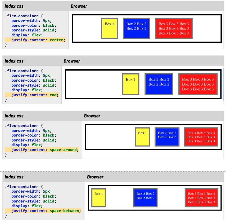
Aligning flex elements horizontally
Flex features are initialized by setting the value of the display property to flex as shown below. The flex property applies to the elements contained in the parent. Here, flex is applied to box 1, 2, and 3 contained in .flex-container. By default flex elements are aligned to the left in their container..
.flex-container {
   border-width: 5px;
   border-color: black;
   border-style: solid;
   display: flex;
}
Elements within a flex container can be justified in many ways such as at the start, center, and end. Additionally you can add space-around or between the elements. Here are examples of using center, end, space-around and space-between justifications. In your HTML and CSS files, create independent examples that illustrate each of the following justification properties.
Aligning flex elements vertically
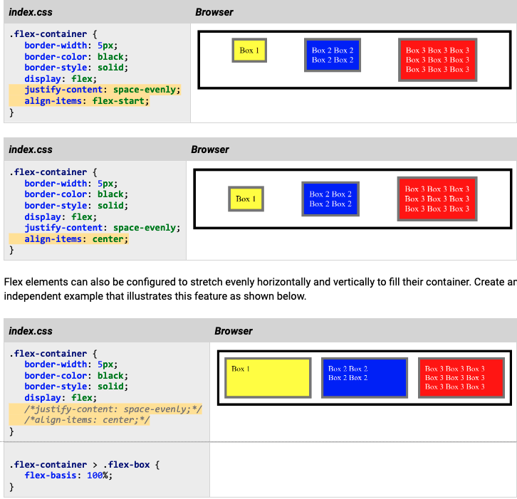
Flex elements can also be justified vertically with the align-items property. Setting the align-items property to flex-start aligns the elements at the top of their container. Setting it to center aligns the elements vertically in the middle of the container, and flex-end aligns the elements vertically at the bottom of the container.
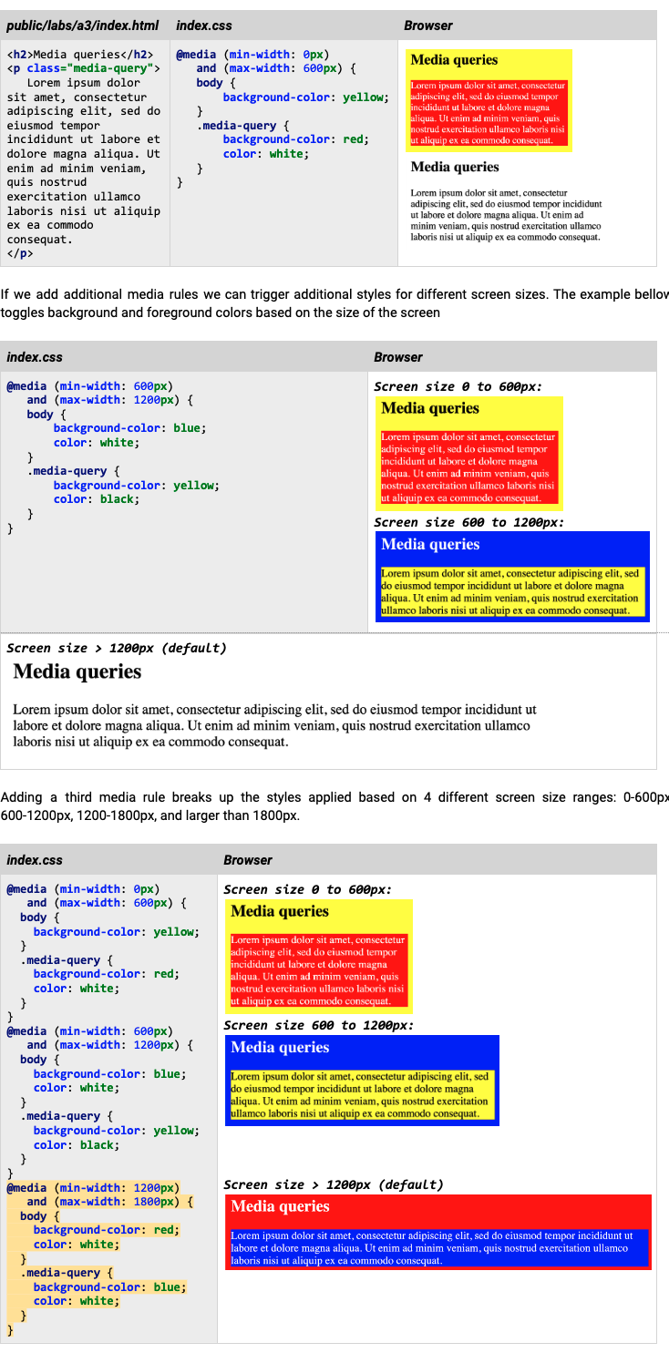
Media queries
Media queries allow browsers to adapt their rendering for specific media types such as printed media, screens, projectors, etc. Media output can be configured to use certain styles for different screen sizes. The examples below illustrate how we can apply a certain style for a specific window size range. In the example below we set the body’s and paragraph’s background color based on the size of the window